Petal + Stem
Branding, Logo Identity
Featured on CreativeBoom

Client: Petal + Stem (mock brief)
My Role: Brand and Logo Designer
Deliverables: Brand and Identity for the florist
Software and Tools: Adobe Illustrator, Adobe Photoshop
Challenge:
To design the brand identity for PETAL & STEM, an independent florist founded by two best friends who left their day jobs to follow their passion. They specialise in seasonal British blooms and foraged arrangements. No imports. No filler flowers. Just what's growing, right now. This is floristry that celebrates friendship, locality, and the beauty of what's in season. The brand needs to feel: Warm but not cutesy. Independent but not amateur. Modern but rooted in nature. Think Sunday morning farmers' market energy meets considered, confident design.
Approach:
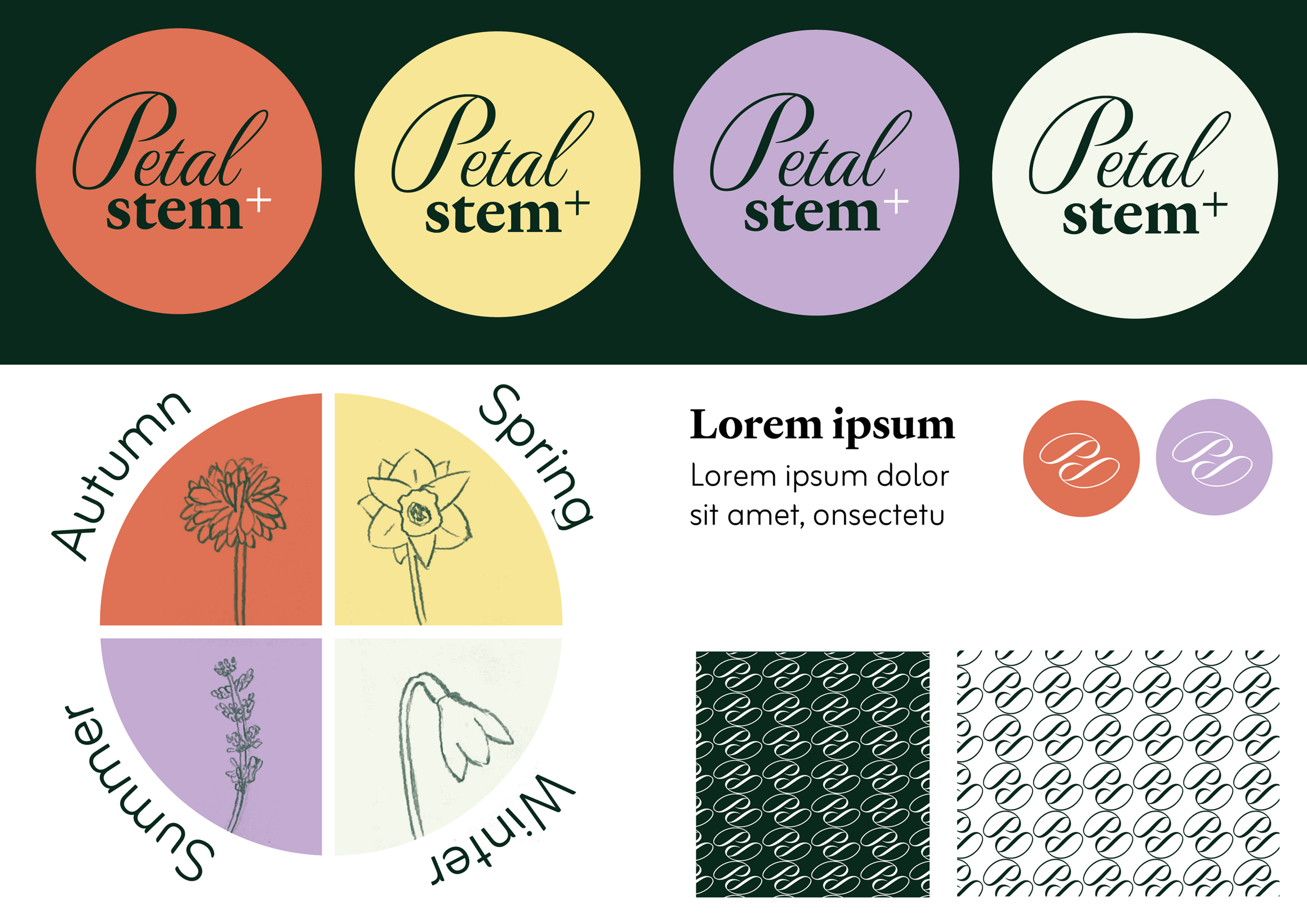
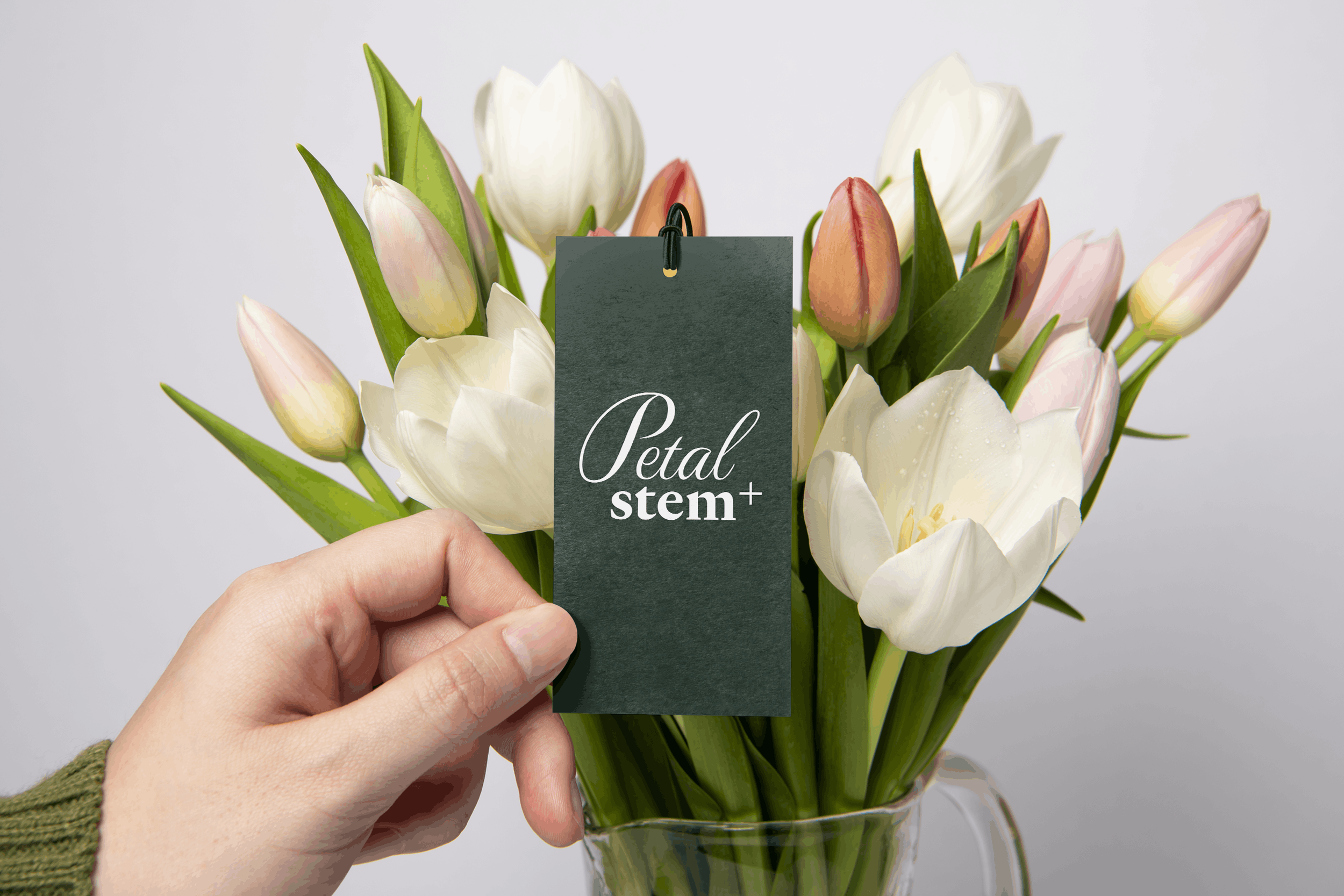
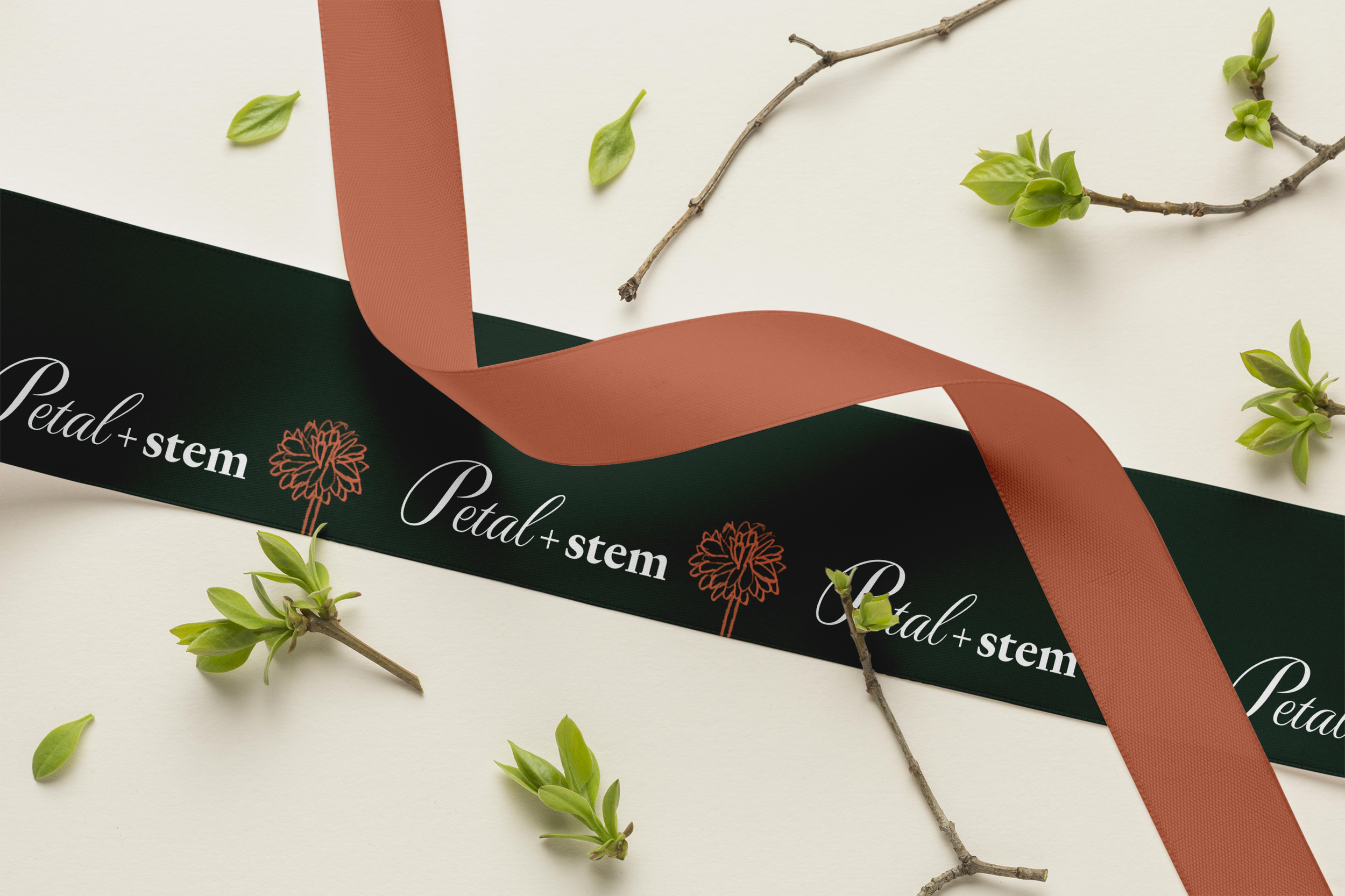
For the Petal & Stem brief, I wanted to capture the founders’ joy in following their passion with a soft yet optimistic colour palette. The logo brings together the elegant form of a petal and the bold, solid stem. I opted for a plus symbol instead of the ampersand, as seasonal British blooms are integral to the business, and the plus symbol divides into the four seasons. A colour from the palette represents each season and is inspired by a flower that grows during that season! I then developed the seasonal flowers into illustrations that complemented the brand's graphic, vector-style elements. Also, the ‘petal-like’ P lent itself to a pattern and mark, to bring it all together.
Result:
The design was well-received and featured on CreativeBoom!