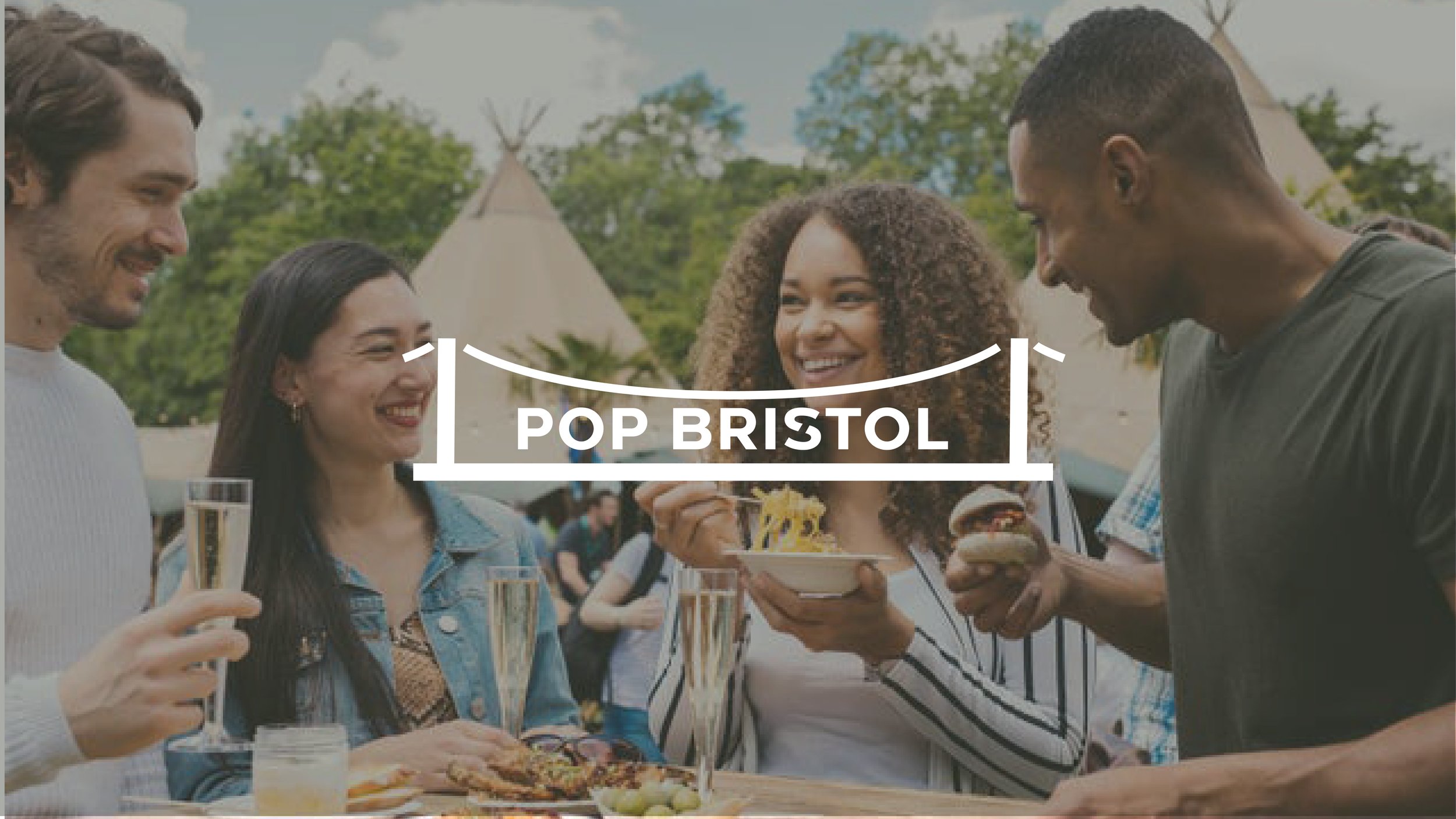
Pop Bristol
Branding, Digital, Animation

THE CHALLENGE
To develop a brand identity for Pop Bristol, the latest location from the team behind Pop Brixton. The look and feel needed to connect to the original Pop Brixton brand, while reflecting the culture and landscape of Bristol.

MY APPROACH
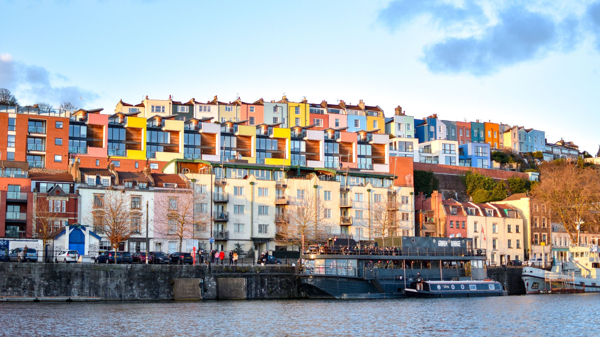
I developed the logo from the sister company, Pop Brixton's logo. I incorporated the iconic Clifton Suspension Bridge. I then created ‘3D’ blocks inspired by the colourful house architecture by Bristol’s river. These were used in the introduction, and the colours became a part of the colour palette.
Inspired by the work of Vincent Raineri, I used this idea to bring continuity between screens through the suspension bridge lines in the Pop Bristol logo.